Building Plask: A GA4 Dashboard That Actually Tells You What Changed
I check Google Analytics every morning. Open the dashboard, scan the numbers, compare to yesterday, try to remember if 1,200 sessions is normal for a Tuesday. Close the tab. Repeat tomorrow.
One day I noticed a 40% traffic drop on one of my apps. It had been dropping for three days. I just hadn’t been paying close enough attention to catch it when it started. By the time I noticed, I’d already lost a weekend’s worth of debugging context.
The problem isn’t that GA4 lacks data. It has too much. What I needed was something that watched the numbers for me and tapped me on the shoulder when something looked off.
So I built Plask.
What GA4 Doesn’t Do
GA4 is powerful. It tracks everything. But it has a fundamental gap: it doesn’t tell you when your metrics are behaving abnormally.
You can set up custom alerts in GA4, but they’re threshold-based. “Alert me when sessions drop below 500.” The problem is that 500 sessions might be perfectly normal on a Sunday but catastrophic on a Monday. Static thresholds don’t account for natural variation—day-of-week patterns, seasonal trends, gradual growth.
What I wanted was statistical anomaly detection. Not “is this number below X?” but “is this number unusual given the historical pattern?”
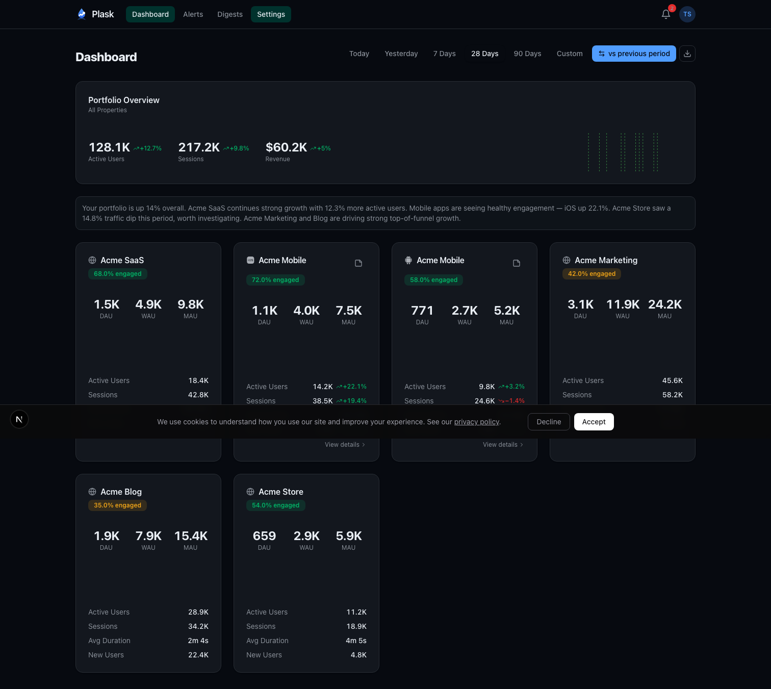
I also wanted a single dashboard for all my properties. I run several apps across iOS, Android, and web. Checking each one individually in GA4 is tedious. I wanted one screen that shows all of them with at-a-glance comparison metrics.
And I wanted someone to write the weekly report for me. Every Monday, I’d spend 20 minutes pulling numbers and writing a summary for myself. That felt like exactly the kind of task AI should handle.
The Architecture
Plask is a Next.js 16 app deployed on Vercel. Users sign in with Google OAuth, and the app requests analytics.readonly scope—read-only access to their GA4 properties. No write permissions, ever.
The stack:
- Next.js 16 with React 19 and Turbopack
- Supabase Postgres via Drizzle ORM
- Auth.js v5 with Google OAuth
- Claude Haiku for AI-generated digests and root cause analysis
- Stripe for subscriptions
- Resend with React Email for transactional emails
- Recharts for sparkline charts
Once connected, Plask auto-discovers all GA4 properties available to the user’s account. A daily cron job syncs metrics at 6 AM UTC—active users, sessions, pageviews, engagement rate, bounce rate, revenue, and more. All stored locally in Postgres so dashboards load instantly without hitting the GA4 API on every page view.
Anomaly Detection With Modified Z-Scores
This is the core of the product, and I spent more time on the statistics than anything else.
The naive approach to anomaly detection is standard deviation. Calculate the mean and standard deviation over a window, flag anything more than 3 standard deviations away. The problem? Standard deviation is sensitive to outliers. If you had one massive traffic spike last month, it inflates the standard deviation and makes future anomalies harder to detect.
Plask uses Modified Z-scores based on Median Absolute Deviation (MAD). Instead of mean and standard deviation, it uses median and MAD:
median = middle value of the 28-day window
MAD = median of |each value - median|
modified_z_score = (0.6745 × (current - median)) / MAD
The 0.6745 constant normalizes MAD to be comparable with standard deviation for normally distributed data. The key property: MAD is robust to outliers. One freak spike doesn’t skew the baseline.
Beyond the core algorithm, there’s meaningful day-of-week filtering. Weekday traffic patterns differ significantly from weekends. When Plask has at least 4 historical samples for the same day of the week, it compares against those instead of the full 28-day window. Your Monday gets compared to other Mondays, not to your quiet Sundays.
There’s also a minimum threshold check per metric. If your app has 3 daily active users, a drop to 1 isn’t meaningful—it’s noise. The system requires minimum volumes (10 active users, 5 transactions, $1 revenue) before flagging anomalies.
Severity classification follows from the Z-score magnitude:
- Info: Z-score at threshold - 1.0 (moderate deviation)
- Warning: Z-score at threshold - 0.5 (significant)
- Critical: Z-score at threshold (extreme)
Users can configure sensitivity per property. High sensitivity catches smaller deviations early. Low sensitivity only fires on extreme events. The default threshold is a Z-score of 3.0.
Smart Alert Prioritization
Not all anomalies are equally important. A critical revenue drop matters more than an info-level bounce in new users. The alert system uses a priority scoring formula:
priority = severity_weight × metric_importance × (1 + |zScore| / 3)
Severity weights range from 1.0 (info) to 4.0 (critical). Metric importance reflects business impact—revenue gets 1.5x, transactions 1.3x, sessions 0.9x. The Z-score boost adds additional weight for extreme deviations.
A critical revenue drop with a Z-score of -6.0 scores 18.0. An informational new-user fluctuation with a Z-score of 2.2 scores 1.39. The inbox sorts by priority, so the things that matter float to the top.
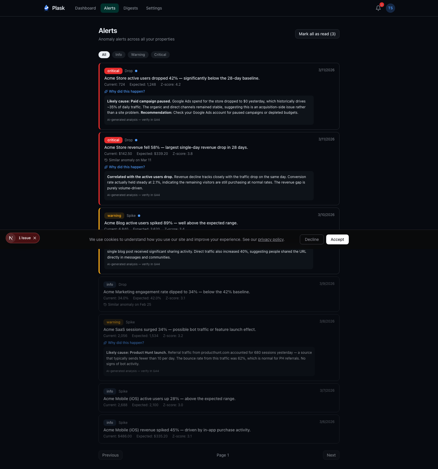
Pro users also get AI-powered root cause analysis. When a warning or critical alert fires, Plask queries the GA4 API for additional context—traffic channels, landing pages, device breakdowns—and sends it to Claude Haiku to generate a probable explanation. “Likely cause: Paid campaign paused. Google Ads spend for this store dropped to $0 yesterday, which historically drives 40% of active users.”
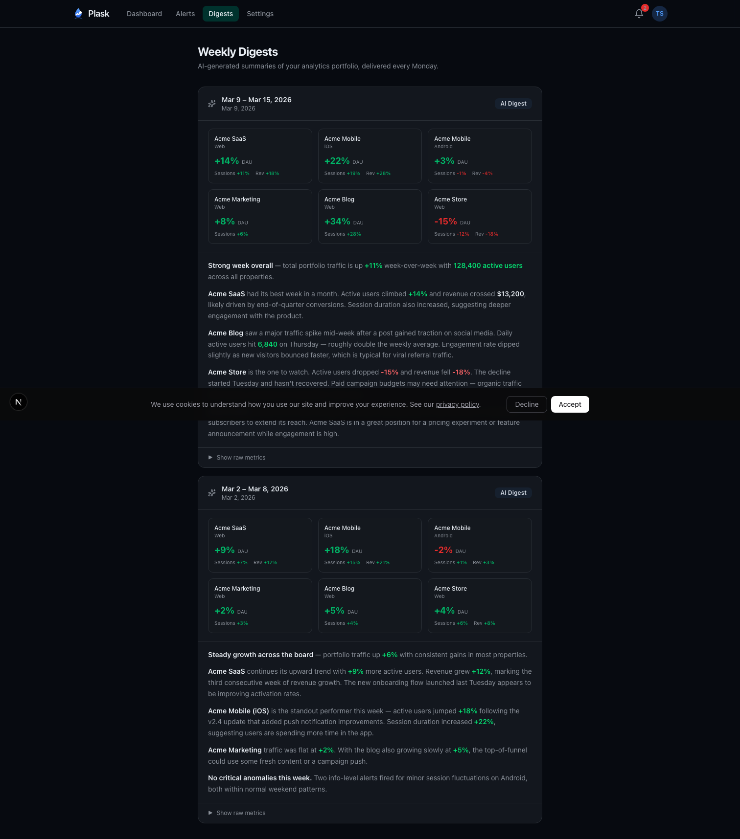
The AI Weekly Digest
Every Monday at 8 AM UTC, Plask generates a digest for each Pro user. The pipeline:
- Aggregate last week’s metrics across all properties (Monday through Sunday)
- Calculate week-over-week deltas
- Pull any user-added annotations (campaign launches, releases, incidents)
- Build a token-efficient prompt with the structured data
- Send to Claude Haiku with strict formatting instructions
- Store the digest with token usage for cost tracking
- Email a copy via Resend
The prompt engineering matters. The system instruction tells Claude to act as an analytics advisor, cite specific numbers, write in prose paragraphs (never bullet points), and consider annotations when explaining trends. The user content is structured data—property names, metrics, deltas, and any context the user has added.
Temperature is set to 0.3 for deterministic output. Max tokens capped at 500 to keep digests concise. The result reads like something a data analyst would write after spending 20 minutes with the numbers.
There’s an idempotency check too—if a digest already exists for a given user and week, the cron job skips it. No duplicate emails if the job retries.
Token Security
OAuth tokens are the most sensitive data in the system. They grant read access to users’ analytics data, and they live in the database.
All tokens are encrypted at rest with AES-256-GCM. The implementation uses version-prefixed payloads—each encrypted blob starts with a version identifier. This enables key rotation: deploy a new key, new encryptions use version 2, old decryptions still work with version 1. Eventually migrate everything and retire the old key.
I chose Auth.js v5 over Supabase Auth specifically because Supabase Auth doesn’t support custom OAuth scopes. I needed analytics.readonly, and that required control over the OAuth flow.
JWT-based sessions avoid hitting the database on every request. The tradeoff is that token revocation isn’t instant, but for a dashboard app the performance win is worth it.
The Business Model
Free tier gets you 2 properties with a full dashboard, in-app alerts, and 30-day data retention. Enough to see the value.
Pro is $9/month or $79/year. You get 10 properties, email and webhook alerts (Slack, Discord), the AI weekly digest, root cause analysis, conversion tracking, CSV export, public dashboards, and 90-day retention.
Stripe handles everything payment-related. Checkout for signups, Customer Portal for management. No custom billing UI. This was a deliberate choice—billing UI is a bottomless pit of edge cases, and Stripe’s hosted pages handle them all.
What I’d Do Differently
Start with fewer metrics. The initial version tracked everything GA4 offered. It was overwhelming. I eventually learned that active users, sessions, and revenue cover 90% of what people actually care about. The other metrics are there for people who want them, but they shouldn’t be front and center.
Ship the digest earlier. The digest is the feature that gets the most positive feedback, but I built it in phase 4. In retrospect, it should have been phase 2. The dashboard is useful, but the digest is what makes people stay—it’s the thing that saves them time every week without them having to open the app.
Day-of-week filtering from day one. The first version of anomaly detection fired too many false positives on weekends. Every Saturday looked like a crisis because traffic was being compared to weekday baselines. Adding same-day comparison cut false positives dramatically.
From Personal Script to SaaS in a Week
Plask didn’t start as a product. It started as a local script I ran on my own machine—a hacky dashboard that pulled my GA4 data, ran the anomaly detection, and dumped results to a terminal. I used that for about a month, tweaking the Z-score thresholds, adding day-of-week filtering when the weekend false positives drove me crazy, layering on the digest when I got tired of writing my own weekly summaries.
After a month of relying on it daily, I realized other people probably had the same problem. The jump from local tool to multi-tenant SaaS took about a week. Next.js for fast iteration, Vercel for zero-ops deployment, Drizzle for type-safe database access, Auth.js for OAuth, Stripe for billing. Most of the hard work—the statistics, the prompt engineering, the edge cases in GA4’s API—was already solved from the month of personal use.
The anomaly detection runs on pure statistics with zero AI cost. Claude is only involved in digests and root cause analysis, keeping the AI bill manageable even as the user base grows. Haiku at 500 tokens per digest, once per week per user—the math works.
The core insight that drove the whole project: analytics tools show you what happened, but they don’t tell you when something unusual happened. That’s the gap Plask fills. Connect your GA4 properties, and stop manually scanning dashboards every morning. Let the statistics do the watching.
Plask is live at plask.dev.
If you found this interesting, you might also like Building Mockingjay: A Video Recorder for When It Matters Most—a very different product, but built with the same philosophy of solving a specific problem that existing tools leave open.
Comments
Reply on Bluesky here to join the conversation.